
IU Mobile Revamp (Part I)
Mar 6, 2018
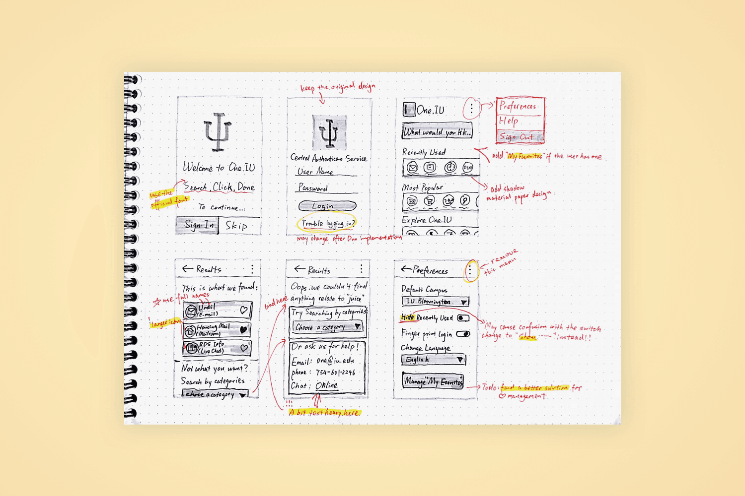
The current official app for IU, IU Mobile, is essentially a container for the web applets offered by IU. It works almost exactly the same as accessing those applets from a browser.
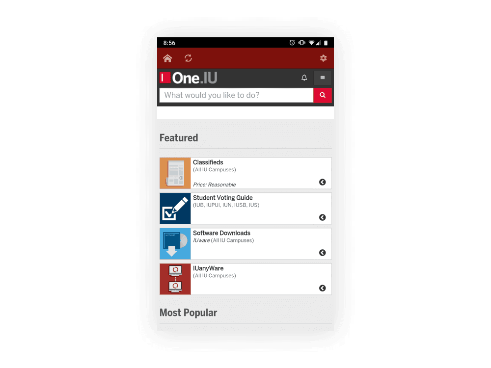
Once users log in with their IU credentials, everyone is directed to the same homepage. It isn’t personalized to fit different user needs, which makes it confusing and time-consuming for people to find exactly what they’re looking for.
When I started this redesign project, I was taking an Intro to HCI Design course with the amazing mentor Marty Siegel. One of my biggest takeaways from that class was the concept of the “whole game” of HCI design. It’s a more traditional, industry-standard approach where each stage of the design process is essential for creating functional products. But it left me with one big question: what happens after the first iteration of an existing product? Do we always start back at the beginning?
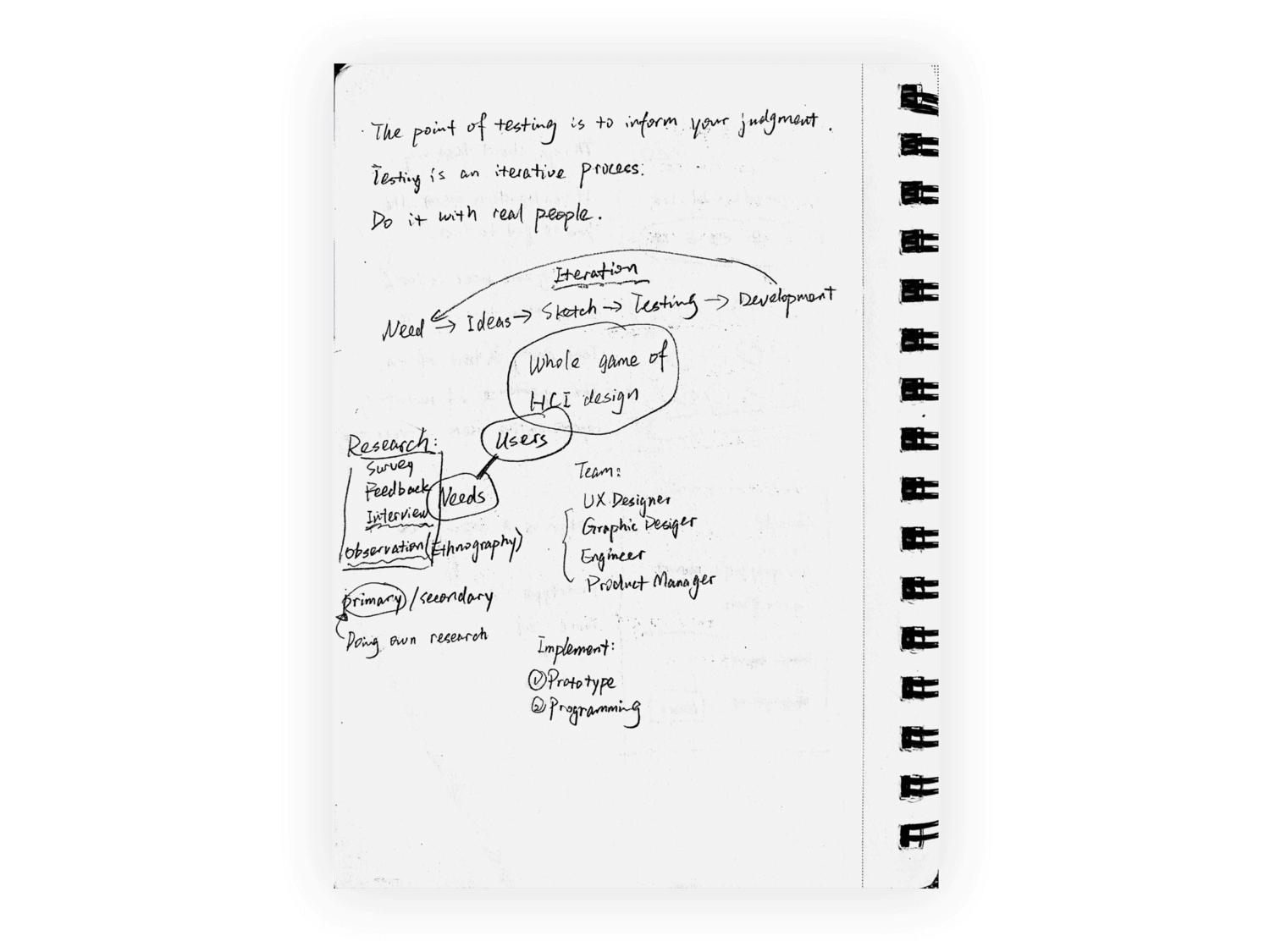
Fail Faster
Sometimes the most valuable lessons come through failure. Every failure is a chance to make improvements — and the best way to do that is to fail faster. In this case, starting with wireframing and sketching helped me quickly uncover the problems in the existing solution.

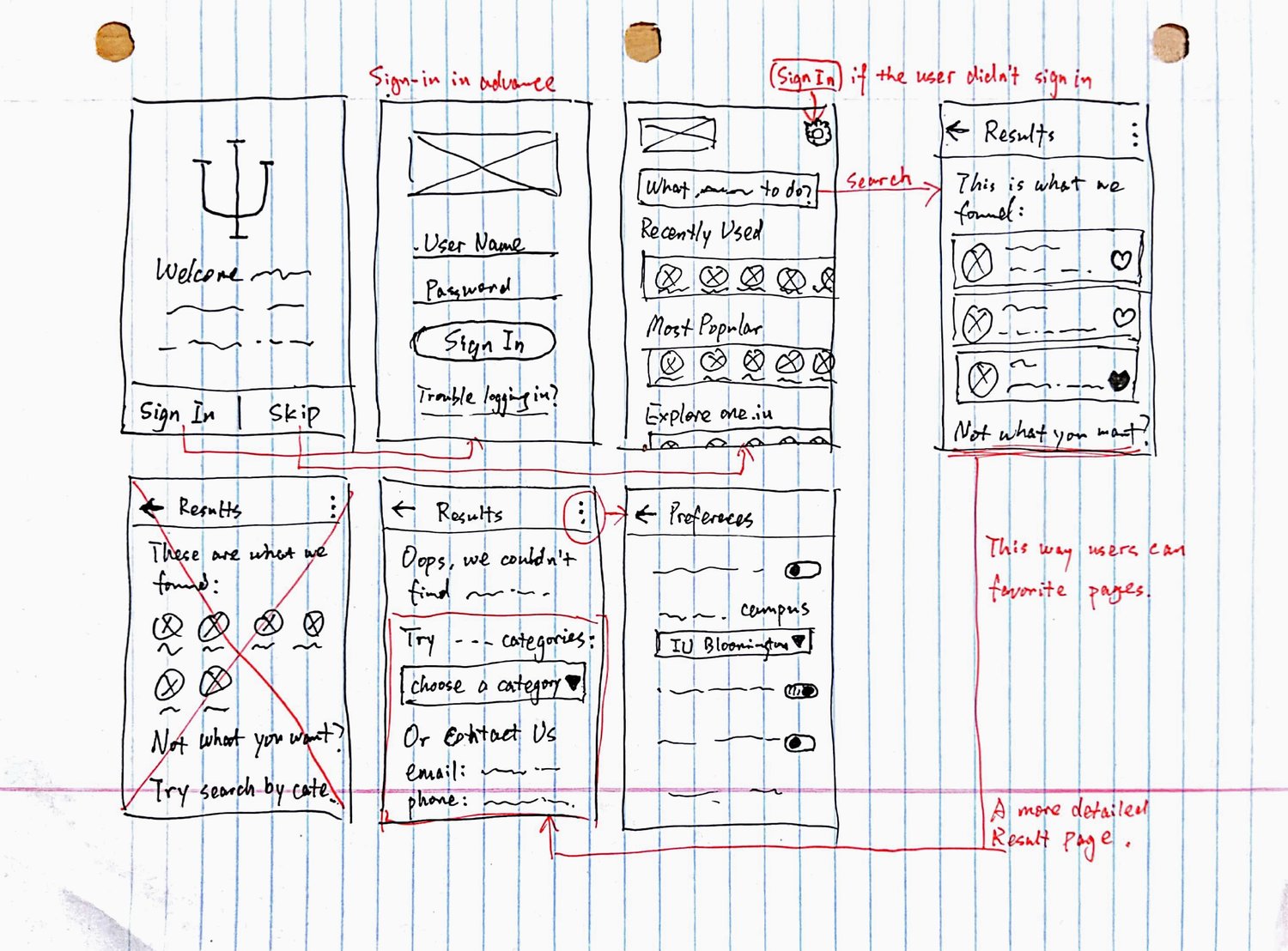
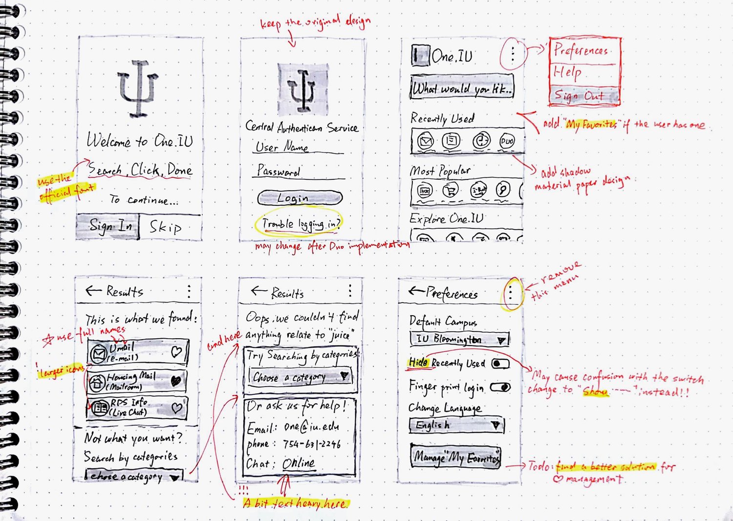
As I rearranged elements, I realized the real issue wasn’t discoverability of the “applets” — it was the lack of proper visualization for the most useful features. This made navigation slow and frustrating. Once I understood that, it was tempting to start interviewing users. But then I remembered another lesson…
"Stop Asking Users What They Want"
At first glance, it seems obvious: interview users, collect feedback, and build what they ask for. But creating exactly what users ask for rarely results in a successful product. That approach works well when you’re refining an already successful product with an established user base. But when you’re trying to create something new or revolutionary, you often need to build the things users don’t even know they want.

Take AirPods, for example. When Apple introduced them in 2016, many people mocked the “stupid” wireless design. Fast forward a few years, and millions of iPhone users wear AirPods daily — and no one misses the headphone jack.
With that in mind, my colleague and I put together a roadmap for IU Mobile:
Our Goal for the First Release
Create a mobile app for IU students, staff, and faculty to access essential daily information. At the same time, provide a quicker way to access key features from One.IU (IU’s central hub of applets).
Features for our Beta Release
A dashboard-like homepage displaying:
For students:
Enrolled classes and classroom location
One.IU search
Nearest dining locations
For faculty/staff:
One.IU search
IU news
Public:
Login page
IU news
A second tab contains:
Detailed IU map with all the building codes
IU bus status
Feedback request
A timely bulletin displaying IU alerts and other important information
Our ultimate goal
It does everything in One.IU as a native application
It has location awareness:
Reminding students to leave for class when students are at home and the class starts in xx minutes
Automatically punch in when employees arrive at their designated offices and punch out when they leave
Android release
Even though we made adjustments along the way, our overall direction remained consistent. The roadmap gave us clarity, and we stayed focused on building an app that was not only functional, but future-ready.